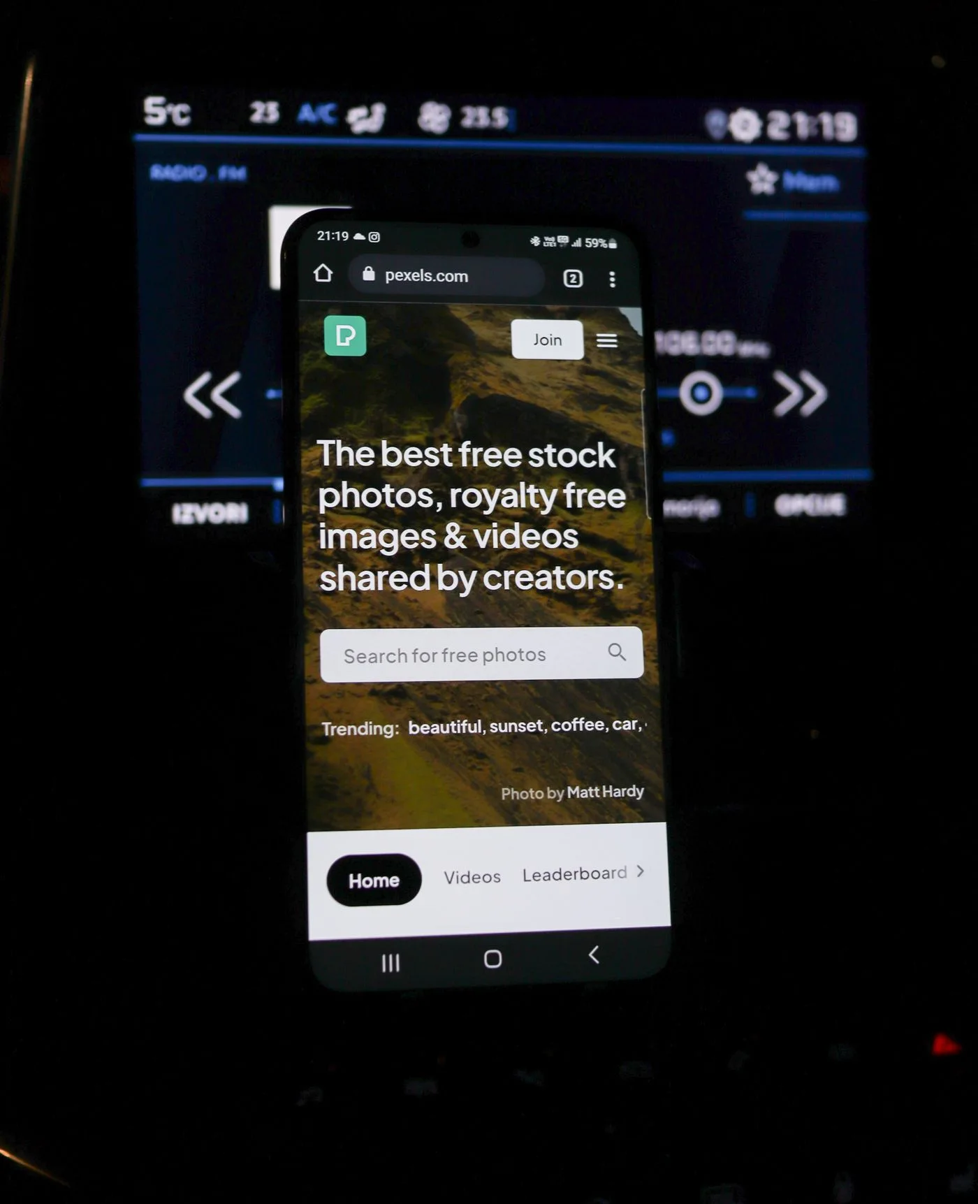
A contact option can look correct on a desktop screen and still be difficult to use on a smartphone. The issue is not simply whether the layout becomes narrower. Visitors need to find a channel, activate it and recognize an alternative if something fails.
Choose a concrete task, such as requesting an appointment. Open the published or locally served page on a phone and begin where a customer would probably arrive. Starting with the form already open misses potential problems in navigation and the service description.
Check telephone and email destinations separately
Tap the telephone number and inspect the destination shown without accidentally placing a real call. The visible number and underlying link can disagree. Old links sometimes survive when a business updates its displayed number.
For an email link, check the recipient and any prefilled subject. Such a link depends on an appropriate application or device configuration. Keep the address readable and copyable as well. A button that hides the actual address gives someone without a configured mail application no useful fallback.
If the page lists several numbers, make their purposes clear before tapping. A mobile layout can separate a label from its number or reorder a pair of columns. Verify the relationship in the rendered page rather than assuming the desktop arrangement survives intact.
Use the form with the keyboard open
Complete the form with realistic test information. Is the active field clear? Does the on-screen keyboard hide instructions or the next action? Do entered answers survive an error correction? Include a longer name and a more detailed message rather than testing only the shortest possible values.
A suitable input keyboard can help, but it does not replace an understandable label. A telephone field should not leave people guessing whether spaces are allowed. Unnecessarily narrow format rules often create avoidable failed attempts.
Try small controls individually. Closely spaced links can be easy to confuse. Check whether a fixed banner covers the contact button. Increase text size and confirm that essential information remains fully available rather than clipped inside a fixed-height box.
Finally, send an agreed test enquiry and verify actual receipt. Record the device, browser and routes tested. Success on one phone does not prove universal device compatibility, but it can reveal concrete failures that desktop-only checks miss. After a correction, repeat the affected journey instead of inspecting only its appearance. A contact route is useful when it completes the task, not merely when its elements fit on the screen.